Khosla Ventures
App Quality Report
Powered by Testers.AI
B+87%
Quality Score
22
Pages
34
Issues
7.6
Avg Confidence
6.6
Avg Priority
2 Critical15 High15 Medium2 Low
Testers.AI
>_ Testers.AI AI Analysis

Khosla Ventures scored B+ (87%) with 34 issues, ranking #35 of 47 VC sites. That's 11 more than the 22.7 category average (15th percentile).

Top issues to fix immediately: "Text is illegible and unreadable due to extremely small font size" โ€” Increase the base font size to at least 12-16px for body text and ensure proper scaling of all text elements; "Missing or incomplete content in key fund sections" โ€” Populate all major fund sections with complete, accurate information including fund strategy, financial metrics, mark...; "Purple footer banner text is difficult to read - insufficient color co" โ€” Increase the contrast between the footer banner text and background by either: (1) using a darker purple background, ....

Weakest area โ€” accessibility (6/10): While visual design is strong, accessibility features like alt text adequacy, color contrast for text, and keyboard navigation ...

Quick wins: Add visible captions or transcripts to all video content for accessibility and engagement. Implement skip navigation links and ensure all interactive elements are keyboard accessible.

Qualitative Quality
Khosla Ventures
Category Avg
Best in Category
Issue Count by Type
UX
19
A11y
16
Content
16
Visual
9
Pages Tested ยท 22 screenshots
Detected Issues ยท 34 total
1
Text is illegible and unreadable due to extremely small font size
CRIT P10
Conf 10/10 OtherUXA11y
Prompt to Fix
The issue is that all text on the page is rendered in an illegibly small font size, making the entire page unreadable. Fix it by increasing all font sizes to meet WCAG readability standards (minimum 12px for body text) and auditing CSS stylesheets for font-size declarations that are too small.
Why it's a bug
The entire page content is rendered in text so small that it is completely unreadable. This is a critical usability failure that prevents any user from interacting with or consuming the content. The text appears to be several pixels in height, making it impossible to read without zooming significantly. This violates WCAG accessibility guidelines regarding readability.
Why it might not be a bug
This could theoretically be intentional if the page is meant to display a preview or thumbnail, but there is no evidence of that in the context provided.
Suggested Fix
Increase the base font size to at least 12-16px for body text and ensure proper scaling of all text elements. Verify CSS font-size properties are set to readable values rather than extremely small units (px, em, or rem).
Why Fix
Users cannot read any content on the page, making the entire interface non-functional. This is a critical accessibility and usability failure that must be resolved immediately.
Route To
Frontend Engineer / UI Developer
Page
Tester
Sharon ยท Security Tester
Technical Evidence
Elements: 
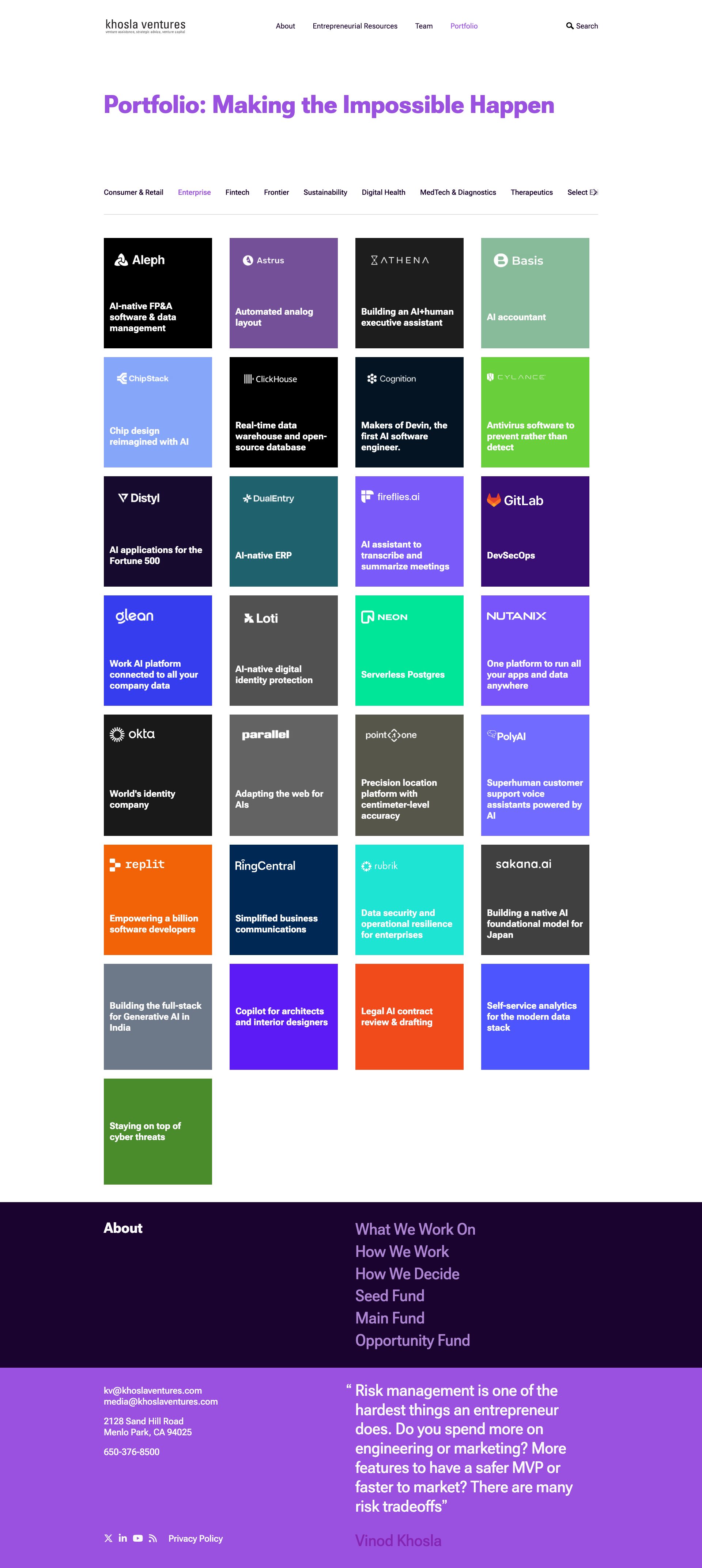
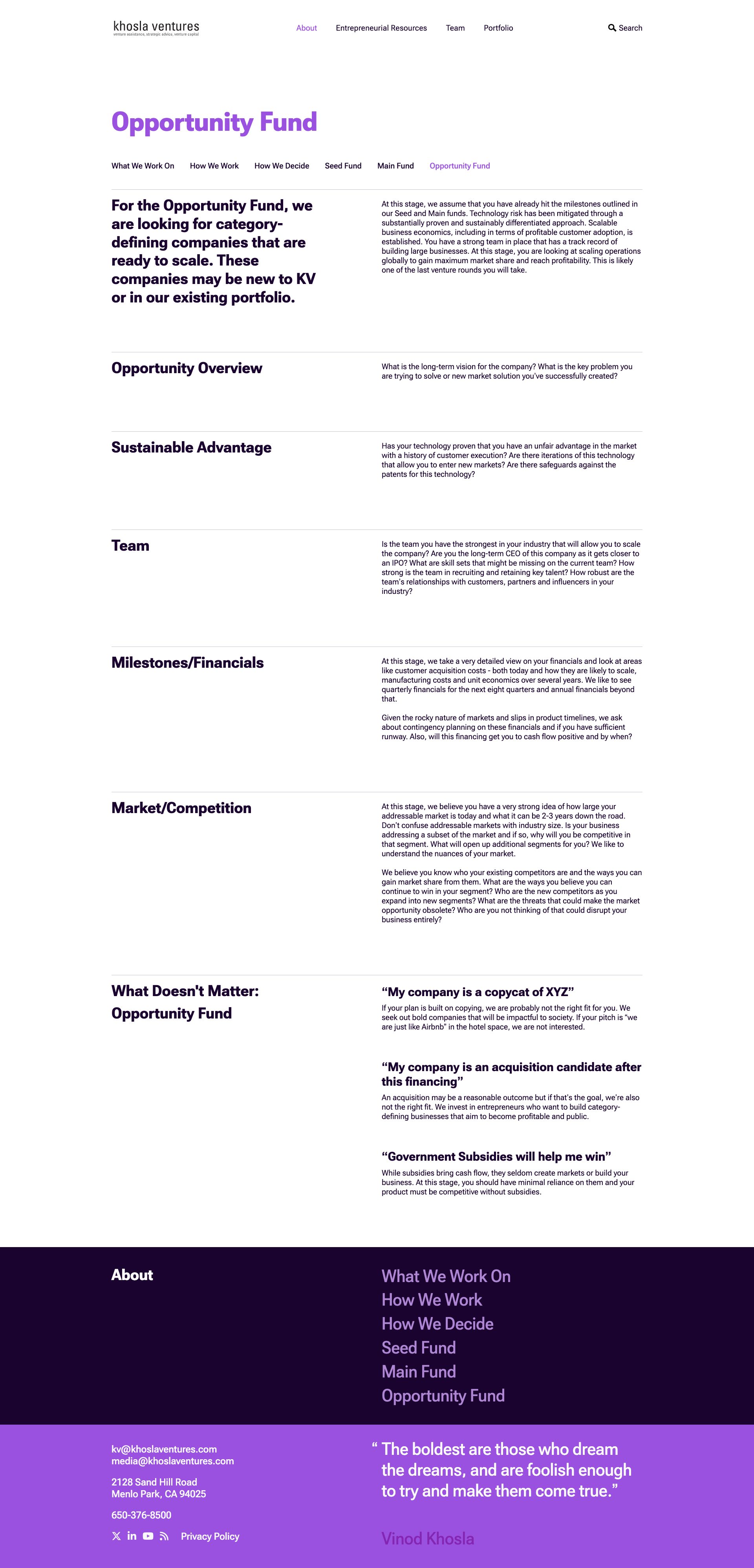
All text elements (p, span, div, h1-h6, etc.)
Console: Check for CSS rendering errors or zoom level issues in browser console
Page Text: All text is present but unreadable
2
Missing or incomplete content in key fund sections
CRIT P9
Conf 7/10 UXContent
Prompt to Fix
The issue is that critical fund information sections only contain placeholder text instead of actual fund details. Fix it by providing complete, substantive content for all major sections including fund overview, financial metrics, and market positioning.
Why it's a bug
Critical sections like 'Opportunity Overview', 'Milestones/Financials', and 'Market/Competition' appear to have only placeholder text with no substantive information. For a fund application page, these sections should contain specific, detailed information about the fund's focus areas, financial details, and competitive positioning.
Why it might not be a bug
The content might be intentionally minimal if this is a template or if full details are provided elsewhere, but for an 'Opportunity Fund' page these sections appear inadequately filled.
Suggested Fix
Populate all major fund sections with complete, accurate information including fund strategy, financial metrics, market analysis, and competitive advantages.
Why Fix
Users need complete information to understand and evaluate the fund before applying. Missing substantive content severely impacts the page's utility and credibility.
Route To
Content Manager / Product Manager
Page
Tester
Sharon ยท Security Tester
Technical Evidence
Elements: <section>, <article>, <div> content areas
Page Text: Opportunity Overview, Milestones/Financials, Market/Competition sections
3
Purple footer banner text is difficult to read - insufficient color contrast
HIGH P8
Conf 8/10 UXA11y
Prompt to Fix
The issue is that the footer banner has insufficient color contrast between the purple background and white text. Fix it by increasing the contrast ratio to meet WCAG AA standards (minimum 4.5:1) through color adjustments to either the background or text.
Why it's a bug
The white/light text on the purple background in the footer banner appears to have insufficient contrast ratio, making it difficult for users with low vision or color blindness to read the content. WCAG 2.1 Level AA requires a minimum contrast ratio of 4.5:1 for normal text.
Why it might not be a bug
The text is technically visible on the screen, though with reduced readability.
Suggested Fix
Increase the contrast between the footer banner text and background by either: (1) using a darker purple background, (2) using white or much lighter text color, or (3) adjusting the purple shade to meet WCAG AA standards (contrast ratio of at least 4.5:1)
Why Fix
Ensuring proper contrast ratios is essential for accessibility compliance and usability for all users, particularly those with visual impairments.
Route To
Frontend Engineer / Accessibility Specialist
Page
Tester
Sharon ยท Security Tester
Technical Evidence
Elements: footer banner with purple background (#8B5FBF or similar), text color appears to be white or light gray
Console: No console errors visible
Page Text: Skeptics never do the impossible or discover anything radically new because they live the safety of conventional thought
+31
31 more issues detected  View all →
Hermes card displays incorrect flight duration claim
Placeholder/Lorem ipsum text visible in production
Overlapping text in purple section - readability issue
and 28 more...
Unlock All 34 Issues
You're viewing the top 3 issues for Khosla Ventures.
Sign up at Testers.AI to access the full report with all 34 detected issues, detailed fixes, and continuous monitoring.
Sign Up at Testers.AI or let us run the tests for you